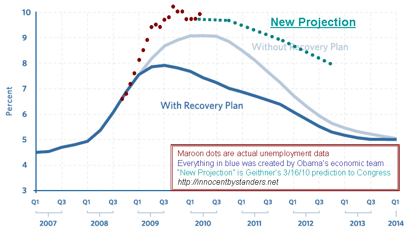
Geoff, blogging at Innocent Bystander, updates the unemployment rate monthly, comparing it to the Obama administration’s original projection. Here’s the update though the end of April.
 The dark blue curve is the projection with the stimulus package. The light blue curve is the miserable future forecast to await us if the stimulus bill had not been passed. The red dots are what really happened – stimulus package and all. It doesn’t fill one with great confidence in either the predicative prowess of the Obama economic team or the beneficial impact of the “stimulus.” Now Geoff has also added Geithner’s “New Projection” from March 16, 2010 so we can all follow along and see how the new projection does.
This plot from DailyKos shows month-by-month change in job loss/gain. Or you can go straight to the source here at the Bureau for Labor Statistics. At least employment would appear to be on the upswing – for now.


